 (Click photo to enlarge.) (Click photo to enlarge.)
|
Found by Cinàedh.

 For Kindle and with free ePub version. Only $9.49 Great reading.
Here is what Gary Shapiro CEO of the Consumer Electronics Association (CEA) said: Dvorak's writing sings with insight and clarity. Whether or not you agree with John's views, he will get you thinking and is never boring. These essays are worth the read!
For Kindle and with free ePub version. Only $9.49 Great reading.
Here is what Gary Shapiro CEO of the Consumer Electronics Association (CEA) said: Dvorak's writing sings with insight and clarity. Whether or not you agree with John's views, he will get you thinking and is never boring. These essays are worth the read!

Subscribe to Main Blog feed here:


Subscribe to Comments too (below):

Bad Behavior has blocked 11014 access attempts in the last 7 days.
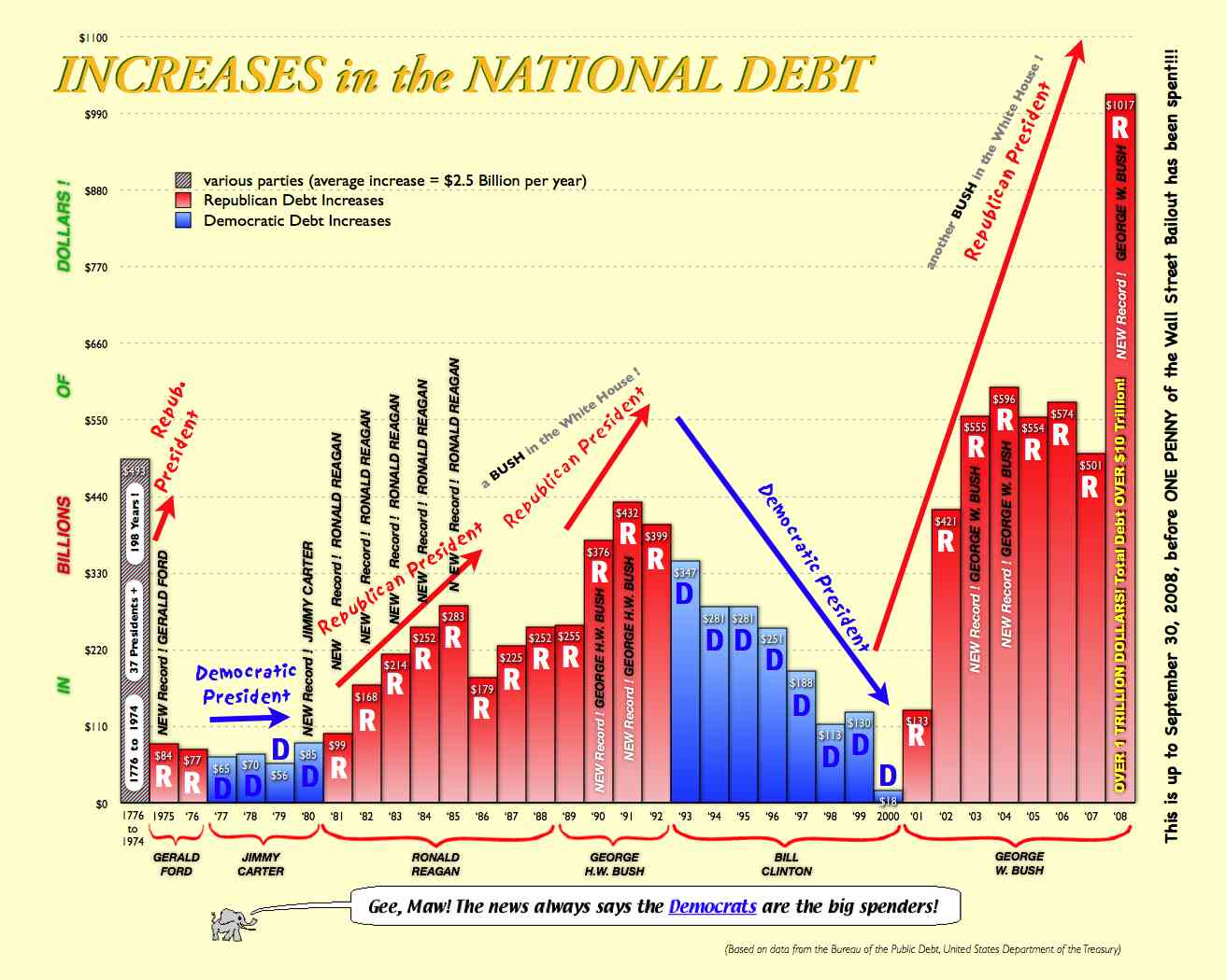
Can we just agree that this chart sucks, the chart showing which party controlling Congress spends more also sucks, and that both parties suck?
Little-known fact: Obama’s failed stimulus program cost more than the Iraq war: http://tinyurl.com/33xhefz
111th Congress Added More Debt Than First 100 Congresses COMBINED: $10,429 Per Person in U.S. (every man, woman, child): http://tinyurl.com/24tanqp
Keep on believin’….
Vindicating George H. W. Bush (41)!
Oh, but it gets better! Look at the Obama years!
What this chart CLEARLY shows is that PUKES intentionally use deficit spending instead of pay as you go to pander to the American Public: “no one cares about the deficit”/starve the beast/get something for nothing.
Problem is, the debt has to get repaid eventually either thru taxes or inflation. Taxation hits the rich, inflation hits the poor.
BushtheMalignantRetard was in charge of the Titanic. He picked the course and the speed. After hitting the iceberg, Obama was elected and put in charge.
Only tools/stooges/idiots “blame” Obama for the deficit spending going on right now–for all the Titanic reasons.
Proof: PUKES declaring the deficit our biggest challenge WHILE voting tax cut extensions.
Patisanship: refusing to accept simple truths.
Anyone here remember when our gov was self sufficient?
From the chart..
AND HOW MUCH of all the money spent in the last 10-12 years WENT to private corps?
IF you dont remember, the USA gov had to RE-PURCHASE over 1/2 the goods they already paid for, that corps were to have STORED for war preparations. ready to be MADE and shipped..and it wasnt THERE.
All that military goods from the war in the 90’s, WAS GONE..we had to re-purchase ALL OF IT.
“Lies, damned lies, and statistics”
Charts are exciting… especially when they are overly simplistic to support a particular view. For example, how much of the decline in deficit growth in the last few years of Clinton’s presidency can be attributed to the increased tax revenue from the stock market bubble?
brm, you are right. The Congress AND Presidents, regardless of which party was occupying the seats, have been out of control now since western governments extrapolated from Keynes that it was perfectly fine to finance themselves through debt.
Who is President has less to do with the spending than who controls Congress. Clinton didn’t want to reduce spending. He had no option.
Bush Jr. was spending wildly on the war and made deals with the Dems who wanted to spend wildly domestically.
Of Course when the Dems took over everything they just spent wildly without even bothering to read the blasted bills. I was incredulous when Nancy P. said you have to vote for the bill first then you can read it as these elected officials did. Congress under Nancy P. and Reed must have been the most irresponsible Congress in the History of the nation.
My, that was fun!
But seriously, we all know that the congress is responsible for the budget, right?
#10–Sea Lawyer==yes, complex idea’s, but even simple ideas, are built up from simple facts. Imagine “an idiot.” No, not Alfie or dismal or do-ill or Thomas or Mickey. A real idiot, not a stooge. An idiot who cannot form even a simple intent, they only do as they are told: give us a chart of the National Debt over the past 30 years.
Viola, you see it posted above.
Its not the chart nor statistic that are clever but the “arguments” that are spun from it. The chart is about one thing, you deride it and direct attention elsewhere. Yes, econimics/Nat Debt is a combination of many different competing effects.
Sea Level, you note BUT one reason why THE CHART IS THE WAY IT IS! You support the validity of the chart while intimating it is somehow wrong at the same time.
Thats not the work of an idiot, and a real challenge for a stooge. You must be a lawyer, yes a lawyer. Perhaps not sea worthy but of the same tribe. Why tell an outright lie when all you have to do is provide the idiots and stooges with matches after dousing the area in gasoline? “Not my fault.” If not a lawyer, then a good PUKE apologist.
Why do you defend what is undermining your own life? DEFICIT SPENDING = the most regressive tax there is.
Good job Hoomans.
Where are the two giant blue bars that belong on the right side of the chart?
The last bar on the chart (2008) is 1017. The two missing bars would be 1573 (2009) and then 1650 (2010). Those two bars would have ended just below the title of the web page.
Don’t you hate it when the facts get in the way of a good political argument.
LOL
who was in charge of Congress during those reagan years?…..oh yeah, DEMS! who was in charge of Congress during the last 2 Bush years…..oh yeah the DEMS!
that chart is so much BS it should be in tones of brown with bits of corn
I also love that they put “a new record” under the last year of Bush while forgetting that 09-10 would make the page 3 times taller
Somebody–perhaps being seen in agreement with Alfie is reBUKE enough but you also make the same repulsive error that Sea Lawyer does. What kind of fake lawyer/hooman are you?
Presidents can veto a budget and have lots of input into what the congressional budget is. The Nat Debt is still as posted, If you want to label the progress with cost of oil, or also plot the Dow Jones Average, or who was in charge of Congress, or just the House, or the Senate, or how many filibusters were mounted, or anything else you are free to do so==but you only spread the gasoline.
The Nat Debt is still as posted. Deficit spending still is the WORST of regressive taxes.
Silly sheep, arguing for their own destruction. You guys DESERVE whats coming. High tax Liberals like myself don’t.
Ha, ha.. Yes, HIGH TAXATION is honest. Low taxation is dishonest. You can chart that too.
Gee…mighty convenient they left out most of the 20th century…I’d love to see FDR, JFK, LBJ….hmmmm.
The good news for the R’pukes is their sheeple followers either sweep it under the rug or simply don’t understand the logic that borrowing is equates to spending.
I’m not defending Republicans, I’m trying to defend proper use of math and statistics.
This chart is a perfect example of why charts should never be used and when used by news people, they should never be believed.
Publishing a chart with easily available data missing is the same as telling a lie. Especially when the missing data does not support the point that is trying to be made.
So the “Change we can beleive in” is that Democrats can increase it by 50% in two years.
http://brillig.com/debt_clock/
I would also point out that the use of raw numbers is almost always misleading. In almost every case, data analysis needs to be presented as a ratio. Most honest representations of Debt is shown as a ratio between the debt and GDP.
Data presented in dollars spanning a long period of time should also be adjusted for inflation. Numbers from 50 years ago will always look small when they are not adjusted to present day dollars.
I could go on and on about what is wrong with this chart and I might.
Who is President has less to do with the spending than who controls Congress.
I dunno…presidents set the spending agenda. At least this is true for all the major spending events over the last decade or two.
At some point our spending will come down either by our own accord (doubtful) or by no one buying our worthless government bonds. That will be when the shit hits the fan. My bet is that our armed forces are going to be much smaller in 2020 than 2010. We will cut defense to pay for the boomers retirement. Just watch.
#10 “Charts are exciting… especially when they are overly simplistic to support a particular view.”
I guess you’d rather have a chart that says nothing in an unclear way?
#4 Yeah, he wasn’t insane. Remember “voodoo economics.” He saw and identified the problem, but he did go along to get along. Glass half full.
#10, #12, #13 Here is another debt chart. Note the massive increase in debt-to-gdp ratio starting in 1980. Can anyone tell me what pile of crap was elected prez in 1980? Can’t recall, huh?
http://en.wikipedia.org/wiki/File:USDebt.png
Here is another good page of info graphics:
http://en.wikipedia.org/wiki/National_debt_by_U.S._presidential_terms
#19 Um, isn’t that the grey area at the extreme left of the chart. You know, the bit that is labeled “1776-1974 – 37 Presidents – 198 Years”
Open your stupid eyes.
#25: They will cut defense expenses the same way they were cut during Vietnam–by paying the troops nearly nothing. While I was in the Army during the Vietnam era with an E-4, I got paid $4900 per year.
When I got out of the Army, the average wage for people with a technical college degree in those days (1971-74) was roughly $12000 per year. Inflation happened later.
Everyone–just how pointed is the top of your head?
I’m not defending Republicans, I’m trying to defend proper use of math and statistics. /// You do that by correcting the chart or presenting a new/different one. You aren’t defending anything except generalities
This chart is a perfect example of why charts should never be used and when used by news people, they should never be believed. /// Your point here is garbled. Why should charts not be used as opposed to believe? All charts? Annual rainfall? Partisanship makes people look so stupid.
Publishing a chart with easily available data missing is the same as telling a lie. /// No, its not. Its just not spoon feeding the retarded.
Especially when the missing data does not support the point that is trying to be made. /// Wouldn’t including the missing info still be a “chart” which is never to be used and if posted here is not to be believed? Silly boy. The chart is used for two points:
1. Under various parties the debt has averaged 2.5 Billion per year.
2. Add the Obama years without any reference at all to the Bush Depression and you still have: Gee Maw, the news says the Democrats are the big spenders.
What you have is “an exception” in the Obama years. Given the strong trend line, what could explain that?
Only a stooge denies the simple truth.
#24 We will cut defense to pay for the boomers retirement. Just watch
I hope so….Here’s an idea!! Let’s cut defense spending down to the combined total of the next 25 largest military’s !!
Do you think the sheeple will feel safe? Even if those 25 nations are allies? I’m not sure but it’s worth a try.
#23–everyone==two valid good points. You apply them to the chart, and the import of the chart changes how?
Or are you babbling for no point at all?
Always sad to see education getting in the way of common sense.
Wh… What? You mean the whole idea about smaller gummint, conservation of fiscal instruments and the Meaning And Purpose of the term “Conservative” itself are a Big Lie???
I’m shocked. Shocked, I tell you.